The Pivot Table enables you to leverage your Excel skills and create a Pivot Table that displays the results in the form you choose. It is an inherent ability of Excel, which enables you to pivot on certain fields. In ForecastX, these fields are the labels utilized in your Forecast. By selecting from the drop-down menu, you can pivot, or alter the display, to view a particular series.
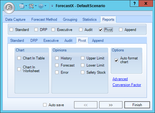
The table below details what each Pivot report feature means.
| Feature | Description |
| Chart |
These are options regarding the charts that can be generated with the pivot report. If no option is selected no chart will be included with the Pivot report. There are two types of Standard charts: 1. Chart in Table - When selected, a Pivot chart is included in the same worksheet as the pivot table. 2. Chart in Worksheet - When selected, a pivot chart is included in a different sheet within the same report. |
| Opinions |
Used to define which Opinion Lines are available in the Pivot report: - History - Includes Historical data. - Forecast - Includes Forecast data. - Error - Includes the error opinion line. - Upper Limit - Includes the upper limit Opinion Line. - Lower Limit - Includes the lower limit Opinion Line. - Safety Stock - Includes Safety Stock Opinion Lines. Note: When an Opinion Line is added to be included in the Pivot report it can be hidden from the reports option, but if an Opinion Line is not included in the report when it is created the reports needs to be generated again to include it. |
| Options |
This section includes general settings for the Pivot report: - Auto format chart - Makes the lines in the chart thicker. |
Comments
0 comments
Please sign in to leave a comment.